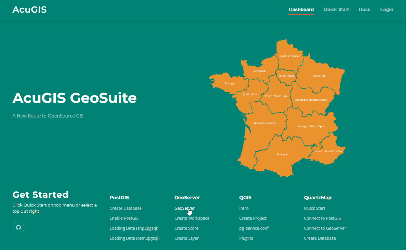
 PostGIS
 Mobile
 QGIS
QGIS MapBender
 GeoServer
 GeoNode
 GeoNetwork
 Novella
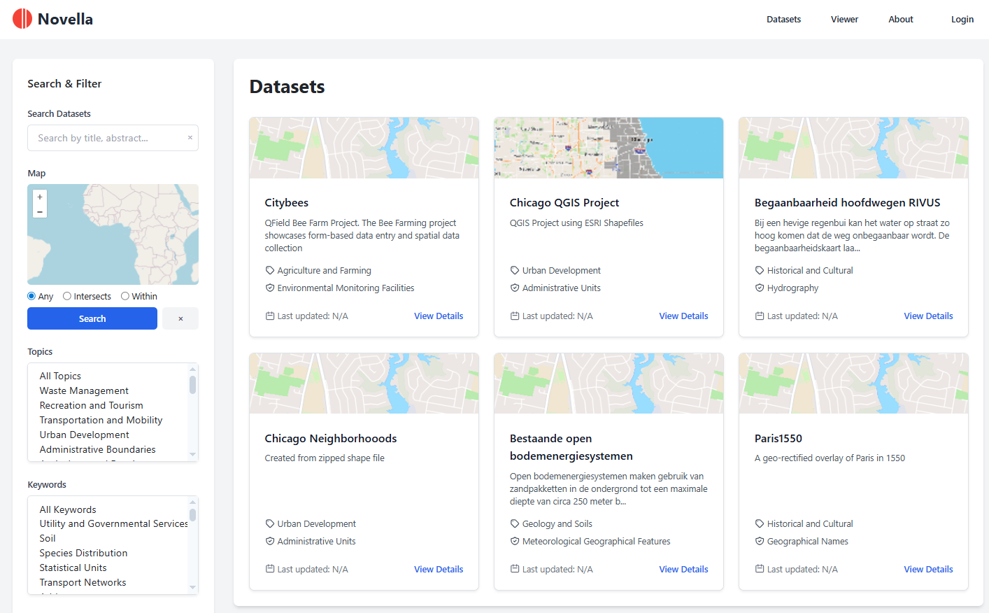
 Solutions


309 lines
8.1 KiB
HTML
309 lines
8.1 KiB
HTML
<section>
|
|
<div class="page-header">
|
|
<h1 id="dropdown">Dropdown</h1>
|
|
</div>
|
|
|
|
<p>
|
|
Select2 allows you to change the way that the dropdown works, allowing you
|
|
to do anything from attach it to a different location in the document or
|
|
add a search box.
|
|
</p>
|
|
|
|
<h2 id="dropdownParent">
|
|
Attached to body
|
|
</h2>
|
|
|
|
<p>
|
|
By default, Select2 will attach the dropdown to the end of the body and
|
|
will absolutely position it to appear below the selection container.
|
|
</p>
|
|
|
|
<div class="row">
|
|
<div class="col-sm-6">
|
|
<dl class="dl-horizontal">
|
|
<dt>Key</dt>
|
|
<dd><code>dropdownParent</code></dd>
|
|
|
|
<dt>Value</dt>
|
|
<dd>jQuery element or DOM node</dd>
|
|
|
|
<hr />
|
|
|
|
<dt>Adapter</dt>
|
|
<dd>
|
|
<code title="select2/dropdown">DropdownAdapter</code>
|
|
</dd>
|
|
|
|
<dt>Decorator</dt>
|
|
<dd>
|
|
<code title="select2/dropdown/attachBody">AttachBody</code>
|
|
</dd>
|
|
</dl>
|
|
</div>
|
|
|
|
<div class="col-sm-6">
|
|
<div class="alert alert-warning">
|
|
<strong>Heads up!</strong>
|
|
This will cause DOM events to be raised outside of the standard
|
|
Select2 DOM container. This can cause issues with
|
|
third-party components such as modals.
|
|
</div>
|
|
</div>
|
|
</div>
|
|
|
|
<p>
|
|
When the dropdown is attached to the body, you are not limited to just
|
|
displaying the dropdown below the container. Select2 will display above
|
|
the container if there is not enough space below the container, but there
|
|
is enough space above it. You are also not limited to displaying the
|
|
dropdown within the parent container, which means Select2 will render
|
|
correctly inside of modals and other small containers.
|
|
</p>
|
|
|
|
<h2 id="dropdown-attachContainer">
|
|
Attached below the container
|
|
</h2>
|
|
|
|
<p>
|
|
Select2 can place the dropdown directly after the selection container, so
|
|
it will appear in the same location within the DOM as the rest of Select2.
|
|
</p>
|
|
|
|
<div class="row">
|
|
<div class="col-sm-6">
|
|
<dl class="dl-horizontal">
|
|
<dt>Adapter</dt>
|
|
<dd>
|
|
<code title="select2/dropdown">DropdownAdapter</code>
|
|
</dd>
|
|
|
|
<dt>Decorator</dt>
|
|
<dd>
|
|
<code title="select2/dropdown/attachContainer">AttachContainer</code>
|
|
</dd>
|
|
</dl>
|
|
</div>
|
|
|
|
<div class="col-sm-6">
|
|
<div class="alert alert-warning">
|
|
<strong>Check your build.</strong> This module is only included in the
|
|
<a href="index.html#builds-full" class="alert-link">full builds</a> of
|
|
Select2.
|
|
</div>
|
|
</div>
|
|
</div>
|
|
|
|
<div class="alert alert-info">
|
|
<strong>
|
|
<a href="https://harvesthq.github.io/chosen/">Harvest Chosen</a>
|
|
migrators!
|
|
</strong>
|
|
If you are migrating to Select2 from Chosen, this option will cause
|
|
Select2 to position the dropdown in a similar way.
|
|
</div>
|
|
|
|
<h2 id="dropdown-search">
|
|
Search
|
|
</h2>
|
|
|
|
<p>
|
|
Users can filter down the results by typing a search term into a box that
|
|
is displayed at the top of the dropdown.
|
|
</p>
|
|
|
|
<dl class="dl-horizontal">
|
|
<dt>Adapter</dt>
|
|
<dd>
|
|
<code title="select2/dropdown">DropdownAdapter</code>
|
|
</dd>
|
|
|
|
<dt>Decorator</dt>
|
|
<dd>
|
|
<code title="select2/dropdown/search">DropdownSearch</code>
|
|
</dd>
|
|
</dl>
|
|
|
|
<p>
|
|
A search box is added to the top of the dropdown automatically for select
|
|
boxes where only a single option can be selected.
|
|
</p>
|
|
|
|
<h3 id="dropdown-minimumInputLength">
|
|
Minimum search term length to filter results
|
|
</h3>
|
|
|
|
<p>
|
|
Sometimes when working with large data sets, it is more efficient to start
|
|
filtering the results when the search term is a certain length. This is
|
|
very common when working with remote data sets, as allows for only
|
|
significant search terms to be used.
|
|
</p>
|
|
|
|
<div class="row">
|
|
<div class="col-sm-6">
|
|
<dl class="dl-horizontal">
|
|
<dt>Key</dt>
|
|
<dd><code>minimumInputLength</code></dd>
|
|
|
|
<dt>Value</dt>
|
|
<dd>integer</dd>
|
|
</dl>
|
|
</div>
|
|
|
|
<div class="col-sm-6">
|
|
<dl class="dl-horizontal">
|
|
<dt>Adapter</dt>
|
|
<dd>
|
|
<code title="select2/data/base">DataAdapter</code>
|
|
</dd>
|
|
|
|
<dt>Decorator</dt>
|
|
<dd>
|
|
<code title="select2/data/minimumInputLength">MinimumInputLength</code>
|
|
</dd>
|
|
</dl>
|
|
</div>
|
|
</div>
|
|
|
|
<h3 id="dropdown-maximumInputLength">
|
|
Maximum search term length to filter results
|
|
</h3>
|
|
|
|
<p>
|
|
In some cases, search terms need to be limited to a certain range. Select2
|
|
allows you to limit the length of the search term such that it does not
|
|
exceed a certain length.
|
|
</p>
|
|
|
|
<div class="row">
|
|
<div class="col-sm-6">
|
|
<dl class="dl-horizontal">
|
|
<dt>Key</dt>
|
|
<dd><code>maximumInputLength</code></dd>
|
|
|
|
<dt>Value</dt>
|
|
<dd>integer</dd>
|
|
</dl>
|
|
</div>
|
|
|
|
<div class="col-sm-6">
|
|
<dl class="dl-horizontal">
|
|
<dt>Adapter</dt>
|
|
<dd>
|
|
<code title="select2/data/base">DataAdapter</code>
|
|
</dd>
|
|
|
|
<dt>Decorator</dt>
|
|
<dd>
|
|
<code title="select2/data/maximumInputLength">MaximumInputLength</code>
|
|
</dd>
|
|
</dl>
|
|
</div>
|
|
</div>
|
|
|
|
<h3 id="dropdown-maximumInputLength">
|
|
Minimum results to display the search box
|
|
</h3>
|
|
|
|
<p>
|
|
When working with smaller data sets, the search box can take up more space
|
|
that is necessary, as there are not enough results for filtering to be
|
|
effective. Select2 allows you to only display the search box when the
|
|
number of search results reaches a certain threshold.
|
|
</p>
|
|
|
|
<div class="row">
|
|
<div class="col-sm-6">
|
|
<dl class="dl-horizontal">
|
|
<dt>Key</dt>
|
|
<dd><code>minimumResultsForSearch</code></dd>
|
|
|
|
<dt>Value</dt>
|
|
<dd>integer</dd>
|
|
</dl>
|
|
</div>
|
|
|
|
<div class="col-sm-6">
|
|
<dl class="dl-horizontal">
|
|
<dt>Adapter</dt>
|
|
<dd>
|
|
<code title="select2/dropdown">DropdownAdapter</code>
|
|
</dd>
|
|
|
|
<dt>Decorator</dt>
|
|
<dd>
|
|
<code title="select2/dropdown/minimumResultsForSearch">MinimumResultsForSearch</code>
|
|
</dd>
|
|
</dl>
|
|
</div>
|
|
</div>
|
|
|
|
<h2 id="dropdown-select-on-close">
|
|
Select the highlighted option on close
|
|
</h2>
|
|
|
|
<p>
|
|
When users close the dropdown, the last highlighted option can be
|
|
automatically selected. This is commonly used in combination with
|
|
<a href="#tags">tagging</a> and <a href="#placeholder">placeholders</a>
|
|
and other situations where the user is required to select an option, or
|
|
they need to be able to quickly select multiple options.
|
|
</p>
|
|
|
|
<dl class="dl-horizontal">
|
|
<dt>Adapter</dt>
|
|
<dd>
|
|
<code title="select2/results">ResultsAdapter</code>
|
|
</dd>
|
|
|
|
<dt>Decorator</dt>
|
|
<dd>
|
|
<code title="select2/dropdown/selectOnClose">SelectOnClose</code>
|
|
</dd>
|
|
</dl>
|
|
|
|
<h2 id="closeOnSelect">
|
|
Close the dropdown when a result is selected
|
|
</h2>
|
|
|
|
<p>
|
|
Select2 will automatically close the dropdown when an element is selected,
|
|
similar to what is done with a normal select box. This behavior can be
|
|
changed though to keep the dropdown open when results are selected,
|
|
allowing for multiple options to be selected quickly.
|
|
</p>
|
|
|
|
<div class="row">
|
|
<div class="col-sm-6">
|
|
<dl class="dl-horizontal">
|
|
<dt>Key</dt>
|
|
<dd><code>closeOnSelect</code></dd>
|
|
|
|
<dt>Default</dt>
|
|
<dd><code>true</code></dd>
|
|
</dl>
|
|
</div>
|
|
|
|
<div class="col-sm-6">
|
|
<dl class="dl-horizontal">
|
|
<dt>Adapter</dt>
|
|
<dd>
|
|
<code title="select2/dropdown">DropdownAdapter</code>
|
|
</dd>
|
|
|
|
<dt>Decorator</dt>
|
|
<dd>
|
|
<code title="select2/dropdown/closeOnSelect">CloseOnSelect</code>
|
|
</dd>
|
|
</dl>
|
|
</div>
|
|
</div>
|
|
|
|
<p>
|
|
If this decorator is not used (or <code>closeOnSelect</code> is set to
|
|
<code>false</code>), the dropdown will not automatically close when a
|
|
result is selected. The dropdown will also never close if the
|
|
<kbd>ctrl</kbd> key is held down when the result is selected.
|
|
</p>
|
|
</section>
|
